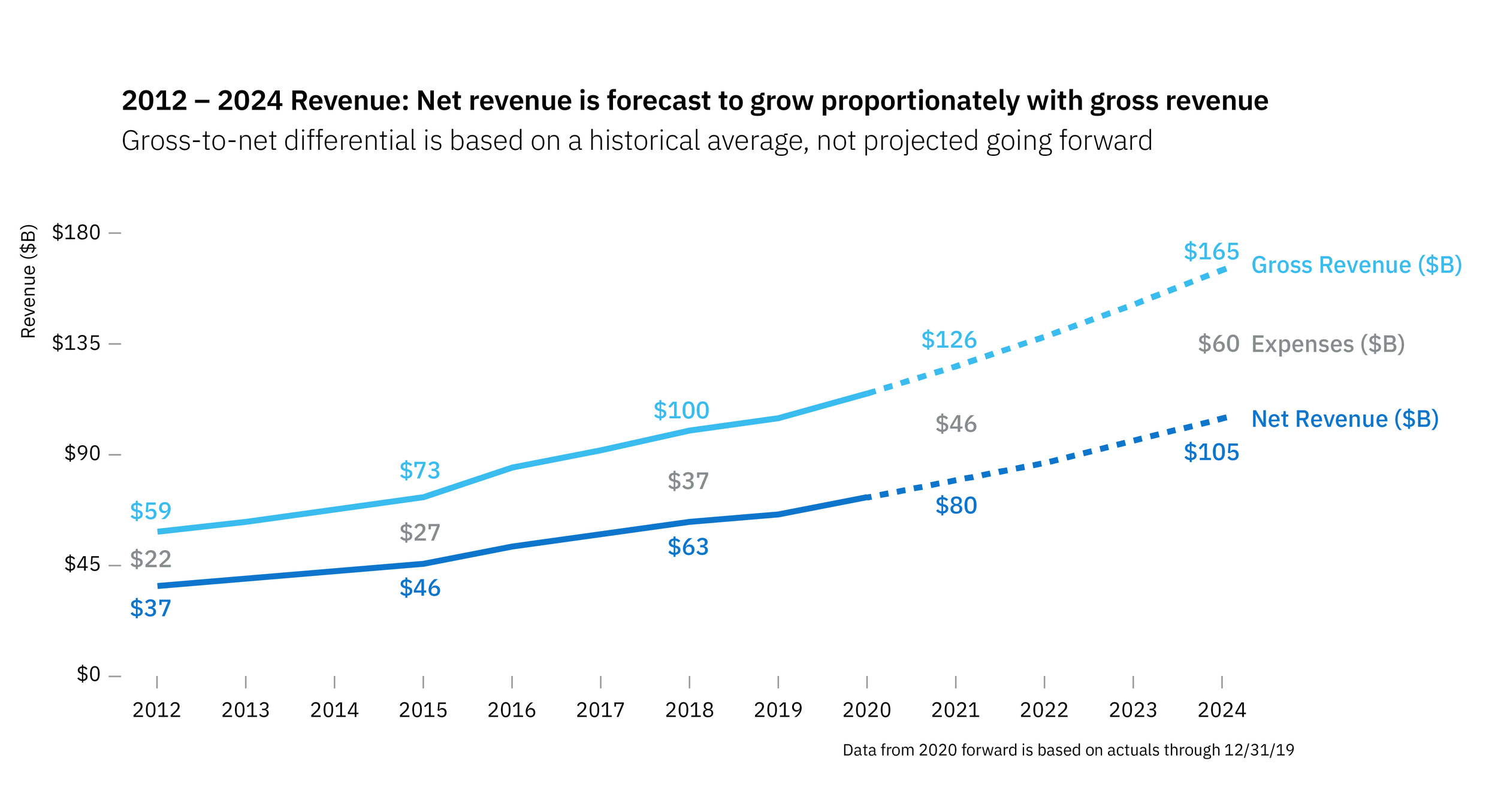
Integrating a data table to tell a story
Reflect on the use of the data table: what are the pros and cons?
I can understand why you would want to include this information, but it adds cognitive load as the viewer pings between the graph points and the numbers. My first step would be to figure out why the data needs to be included. It appears to me that the story isn't so much the specific $ amounts, as it is the relationship between the two. My take on it would be to simplify by only showing numbers for every three years, and to add in the differential to make the point that as time goes on, the growing expenses are keeping the net revenue on a more flat trend than the gross revenue.
What other changes would you make if you were communicating this data?
I would remove and simplify as much as possible. Getting rid of the symbols along the lines, integrating the key with the data lines, integrating the table with the chart. I'd also play with adding the additional data line (expenses), and highlighting that we are showing trends in the future, using dotted lines. I think the title could also be more strategically worded to bring home the point.
Try this exercise yourself at Storytelling with Data!

